Lighting is not merely a retail fixture; it is part of the customer’s first impression. A bright entrance can feel open and energetic, while harsh glare may make polished floors uncomfortable to view. This raises a practical question: how does lighting affect customer experience? The answer involves mood, visibility, product perception, navigation, and time spent in a space.
Professional guidance supports this broader view. The Illuminating Engineering Society’s RP-2-20, Recommended Practice for Retail Lighting, emphasizes illuminance, uniformity, glare control, color quality, and visual hierarchy. These elements help customers notice a display without losing sight of the surrounding store. The U.S. Department of Energy’s 2023 Solid-State Lighting R&D Opportunities report also identifies color quality, visual comfort, controllability, and energy performance as important lighting priorities. These are operational concerns, but they become customer-facing details at shelf level.
Research does not prove that brighter lighting always improves sales. That assumption is too simple. Warm, layered light may support a relaxed restaurant atmosphere, while higher contrast can strengthen a luxury display. Yet poor choices remain easy to notice: a blue-white fitting can make skin look pale, and glare can hide product labels. This article examines the top ways lighting affects customer experience, combining industry standards, environmental psychology, and practical retail observations. Some effects are measurable. Others still require careful testing, because customer responses vary by culture, age, task, and context.
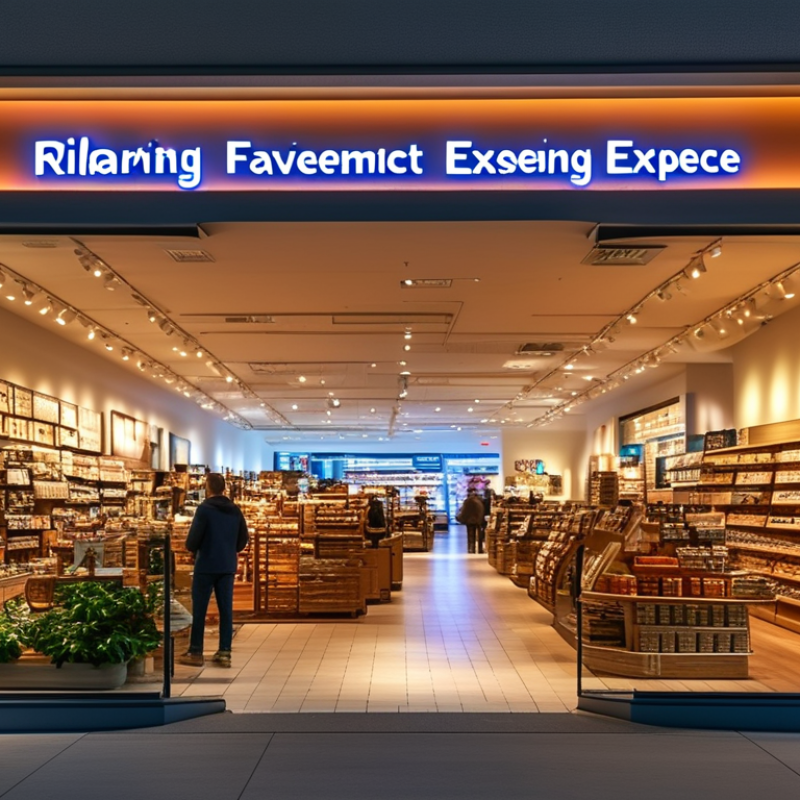
Lighting shapes customer perception before staff say a word. Warm, low-glare light can make a café feel calm, intimate, and worth lingering in. Brighter, cooler light often signals speed, cleanliness, and efficiency. These impressions are not purely visual. A 2023 U.S. Department of Energy lighting market report shows that lighting remains a major electricity use, making quality and control important operational decisions.
In customer-facing spaces, contrast guides attention. A focused beam can highlight fresh food, product texture, or a reception desk. Uniform lighting can reduce visual uncertainty near entrances and payment areas. The Illuminating Engineering Society recommends controlling glare and maintaining suitable illuminance for visual comfort. Customers may not describe these details, but they notice when a display looks flat or a counter feels harsh.
Experience matters here. I have seen customers avoid bright seating areas, even when the space was otherwise attractive. That reaction is easy to misread as poor service. A 2022 report from the International WELL Building Institute also connects lighting quality with perceived workplace wellbeing, although customer behavior is less predictable. Not every warm room feels welcoming. Sometimes it feels dim. Careful testing with real visitors remains essential, because lighting plans can look convincing on paper and still fail at eye level.
Color temperature quietly shapes how customers read a space. Warm light, around 2700K to 3000K, can make cafés, lounges, and boutique interiors feel calm and intimate. Customers may linger longer when the room feels comfortable, although lighting alone cannot create loyalty. In practical retail audits, overly warm light sometimes makes product colors look dull or inaccurate. That detail can weaken trust near mirrors, food displays, or product counters.
Neutral light, usually 3500K to 4000K, offers a balanced impression. It can support browsing, conversation, and clear visual judgment without feeling too clinical. Cooler light may suit pharmacies, gyms, or service areas where alertness matters. Yet excessive blue-white light can feel harsh, expose tired faces, and reduce emotional comfort. Not always. Customer responses vary by age, culture, weather, and time of day. A single setting is rarely perfect.
Tips: Test several temperatures in the real space, not only on a specification sheet. Compare the same product under warm, neutral, and cool light. Check skin tones, packaging, shadows, and reflections. Use dimming or layered fixtures when possible. Review customer behavior at morning, afternoon, and evening. A setup that feels welcoming at noon may feel flat after sunset.
Top Ways Lighting Affects Customer Experience
How Brightness Guides Attention and Movement
Brightness quietly shapes how customers enter, pause, browse, and leave a space. A brighter entrance can signal openness and guide attention toward key displays. Softer lighting may slow movement and encourage customers to examine products more carefully. However, brightness alone does not create comfort. Glare, harsh shadows, and uneven levels can make a store feel tiring or difficult to navigate.
Use light as a visual pathway. Place stronger illumination near entrances, service counters, and important product areas. Keep aisles clear with consistent lighting, especially near floor changes or narrow corners. A light meter can help teams compare levels across the space. Customer observation matters too. Watch where people stop, hesitate, or turn away. A bright room can still feel confusing. That judgment may be imperfect, so test small changes before redesigning everything.
Tips: Check the entrance from the customer’s eye level. Reduce glare on glass and glossy packaging. Use focused light for displays, but keep nearby walking areas comfortable. Compare customer movement during different hours. Natural daylight can change the result. Review the layout again after making adjustments.
Lighting does more than reveal products. It quietly shapes comfort, attention, and buying confidence. In retail and hospitality spaces, I have seen customers leave bright rooms quickly, even when displays were attractive. Harsh overhead light can flatten color, create glare, and make people squint. Soft, balanced illumination feels easier on the eyes. It should still show textures and true product colors. Comfort comes first. Without it, dwell time rarely grows.
Dwell time depends on how long a space feels pleasant to occupy. Warm light near seating can encourage conversation, while brighter task lighting helps customers examine details. Layered lighting works better than one intense source. It creates visual rhythm across shelves, tables, and pathways. Small adjustments matter. A tilted spotlight may illuminate a product beautifully, yet shine directly into a visitor’s eyes. Testing from customer eye level often reveals problems that floor plans miss. Measure dwell time alongside complaints, movement patterns, and staff observations.
Purchases are affected by confidence, not brightness alone. Accurate color rendering helps shoppers judge fabric, food, finishes, and skin tones more reliably. Focused light can guide attention toward a display, but excessive contrast may make nearby products seem unimportant. I have also noticed that dim corners sometimes feel exclusive, but they can reduce trust. The answer is not always more light. It is better control. Dimming and adjustable fixtures help teams respond to daylight and customer behavior. Still, lighting cannot fix confusing layouts or poor service. That lesson is easy to overlook.
Recommended illuminance levels vary by retail zone. Balanced lighting can improve visual comfort, support longer browsing, and make products easier to evaluate, while brighter task areas help customers complete purchases.
The values show commonly recommended illuminance levels in lux for different retail applications: restaurant or lounge areas around 200 lux, general sales areas around 300 lux, checkout areas around 500 lux, and display windows around 1,500 lux. Actual requirements depend on product type, contrast, glare control, and local lighting standards.
Top Ways Lighting Affects Customer Experience
Inclusive lighting can make a shop easier to enter, navigate, and trust. According to the World Health Organization’s World Report on Vision, at least 2.2 billion people live with vision impairment. That figure includes customers who may struggle with glare, weak contrast, or sudden changes in brightness. A bright display is not always a helpful display. Excessive reflections can hide product labels, while deep shadows can make steps and floor edges difficult to read.
Good lighting begins with practical observation. Walk through the space at customer eye level. Check the entrance, payment counter, seating, and toilets. Use even illumination, controlled brightness, and clear contrast between walls, floors, and obstacles. The International Commission on Illumination recommends evaluating glare and visual comfort, not illumination levels alone. EN 12464-1 also provides workplace lighting guidance, including recommended illuminance for retail environments. These standards support safer decisions, but they do not replace real customer feedback.
Older visitors may need more light for detail, while autistic customers may feel distressed by flicker or harsh transitions. People using mobility aids need consistent light across ramps and thresholds. I once noticed a well-lit entrance with a poorly lit payment area. The space looked attractive, yet customers leaned forward to read receipts. A small adjustment in vertical lighting helped. It was not perfect. Color preferences, cultural expectations, and individual sensitivity still vary. Accessibility improves when lighting tests include disabled customers, staff observations, and measured glare checks, rather than relying on appearance alone.
| Lighting Dimension | Inclusive Design Target | How It Affects Customer Experience | Accessibility and Satisfaction Benefit | Reference Basis |
|---|---|---|---|---|
| General illuminance | Approximately 300 lux for general retail or customer areas; avoid abrupt changes between adjacent zones. | Supports product visibility, orientation, reading, and comfortable movement. | Helps older adults and customers with reduced vision identify products, signs, obstacles, and changes in floor level. | Typical maintained illuminance guidance in EN 12464-1 for retail areas. |
| Checkout and service counters | Approximately 500 lux on the working surface, with controlled glare. | Makes payment screens, receipts, cash, product details, and facial expressions easier to see. | Improves communication for customers with low vision, hearing loss, cognitive disabilities, or language barriers who rely on visual cues. | Common service-area target values in EN 12464-1-based lighting design. |
| Uniformity | Aim for a minimum-to-average illuminance ratio of about 0.40 or higher in occupied task areas, subject to the applicable standard. | Reduces distracting bright and dark patches that can make navigation feel uncertain. | Creates a more predictable environment for people with visual impairments, balance concerns, or sensory sensitivities. | Uniformity criteria commonly used in EN 12464-1 lighting applications. |
| Glare control | Keep the Unified Glare Rating at or below approximately UGR 22 in general customer areas, and lower where detailed visual tasks occur. | Prevents discomfort, reflections on screens, squinting, and reduced visual concentration. | Supports customers with cataracts, migraine sensitivity, low vision, and age-related glare sensitivity. | UGR limits are widely specified by EN 12464-1 for indoor work and public environments. |
| Color rendering | Use a color-rendering index of Ra 80 or higher for general customer areas; use higher-quality sources when accurate color judgment is important. | Helps customers distinguish product colors, warning labels, skin tones, and visual information. | Reduces confusion for customers with color-vision deficiencies and improves confidence when selecting products. | Ra 80 is a common minimum design criterion in EN 12464-1 applications. |
| Color temperature | Typically select approximately 2700–4000 K according to the setting, materials, daylight, and customer comfort; maintain consistency within each zone. | Warmer light can feel relaxing, while neutral light can support alertness and clear visual assessment. | Predictable, comfortable color appearance can reduce sensory stress and support longer, more pleasant visits. | Common professional lighting-design range; the appropriate value depends on the application and local guidance. |
| Flicker and temporal light modulation | Use quality drivers and verify flicker performance; avoid visibly flickering sources and installations with pronounced stroboscopic effects. | Reduces eye strain, visual discomfort, distraction, and complaints associated with unstable light output. | Creates a more comfortable environment for people who are sensitive to flicker, including some customers with migraines or neurological conditions. | Assessment approaches are discussed in IEEE 1789 and related lighting-flicker guidance. |
| Vertical and facial illumination | Provide even light on faces, signs, shelves, and vertical surfaces without creating harsh shadows; verify conditions at typical eye level. | Improves recognition, wayfinding, social interaction, and the ability to read vertical information. | Makes lip-reading, facial communication, staff identification, and sign recognition easier. | Inclusive lighting practice and visual-communication design principles. |
| Wayfinding and hazard visibility | Light entrances, routes, stairs, ramps, obstacles, and signs consistently; provide at least 1 lux on the center line of escape routes where EN 1838 applies. | Makes routes easier to understand and reduces hesitation, trips, and accidental contact with obstacles. | Supports independent navigation for customers using mobility aids or experiencing reduced contrast sensitivity. | Emergency-lighting values are based on EN 1838; normal lighting must also meet local building and accessibility requirements. |
| Contrast and reflections | Use lighting that preserves contrast between signs, text, floors, walls, steps, and product labels while minimizing reflections on glossy surfaces. | Improves reading speed, product comparison, and recognition of boundaries and hazards. | Benefits customers with low vision, older customers, and anyone affected by glare or reduced contrast. | Consistent with universal-design and accessible-wayfinding principles; exact contrast requirements depend on local codes. |
| Control and adaptability | Use zoning, dimming, occupancy controls, and adjustable scenes where practical; avoid rapid or unexpected changes in brightness. | Allows lighting to respond to daylight, time of day, activities, and different customer needs. | Provides a calmer experience for people with sensory sensitivities while maintaining sufficient light for visual tasks and safety. | Established energy-management and inclusive-environment design practice; control settings should be tested with users. |
Note: Illuminance, glare, uniformity, emergency-lighting, and color-rendering values are typical design benchmarks rather than universal legal requirements. Always verify the current standards and accessibility regulations applicable to the project location.
: Harsh overhead light can cause glare, flattened colors, and tired eyes. Soft, balanced illumination feels calmer. Comfort matters.
Yes, pleasant lighting can support longer visits. Warm light near seating encourages conversation, while brighter task lighting supports detailed viewing.
Layered lighting combines ambient, task, and focused light. It creates rhythm across shelves, tables, and walkways without relying on one intense source.
Accurate color rendering helps customers judge fabrics, food, finishes, and skin tones. Focused light can guide attention, but excessive contrast may reduce trust.
Glare can hide labels. Deep shadows can obscure steps and floor edges. Flicker and sudden brightness changes may also distress some visitors.
Walk through the space at eye level. Check entrances, counters, seating, ramps, thresholds, and toilets. Include disabled customers and staff observations.
No. Better control is often more useful than higher brightness. Dimming and adjustable fixtures can respond to daylight and changing customer behavior.
Compare dwell time with complaints, movement patterns, and staff notes. Check glare, contrast, and vertical lighting near signs or payment counters.
Not completely. Lighting cannot repair confusing layouts or weak service. It may look impressive, yet customers can still feel uncertain.
A bright display is not always helpful. A spotlight may beautify a product while shining into someone’s eyes. Test from real customer positions.
Lighting plays a central role in shaping how customers perceive and respond to a space. The question “how does lighting affect customer experience” can be answered through its influence on atmosphere, mood, and behavior. Warm color temperatures can create a welcoming and relaxed feeling, while cooler tones may support alertness and a sense of cleanliness. Brightness also helps guide attention and movement by highlighting important areas, defining pathways, and making products or information easier to notice.
Well-planned lighting can improve comfort, encourage customers to stay longer, and positively influence purchasing decisions by creating an environment that feels appealing and easy to navigate. In contrast, excessive glare, harsh shadows, or uneven illumination may cause discomfort and frustration. Inclusive lighting further improves accessibility by supporting people with different visual needs, reducing confusing contrasts, and making spaces safer and more pleasant. Overall, thoughtful lighting design contributes to satisfaction, confidence, and a more memorable customer experience.

CAPIVANA Lighting